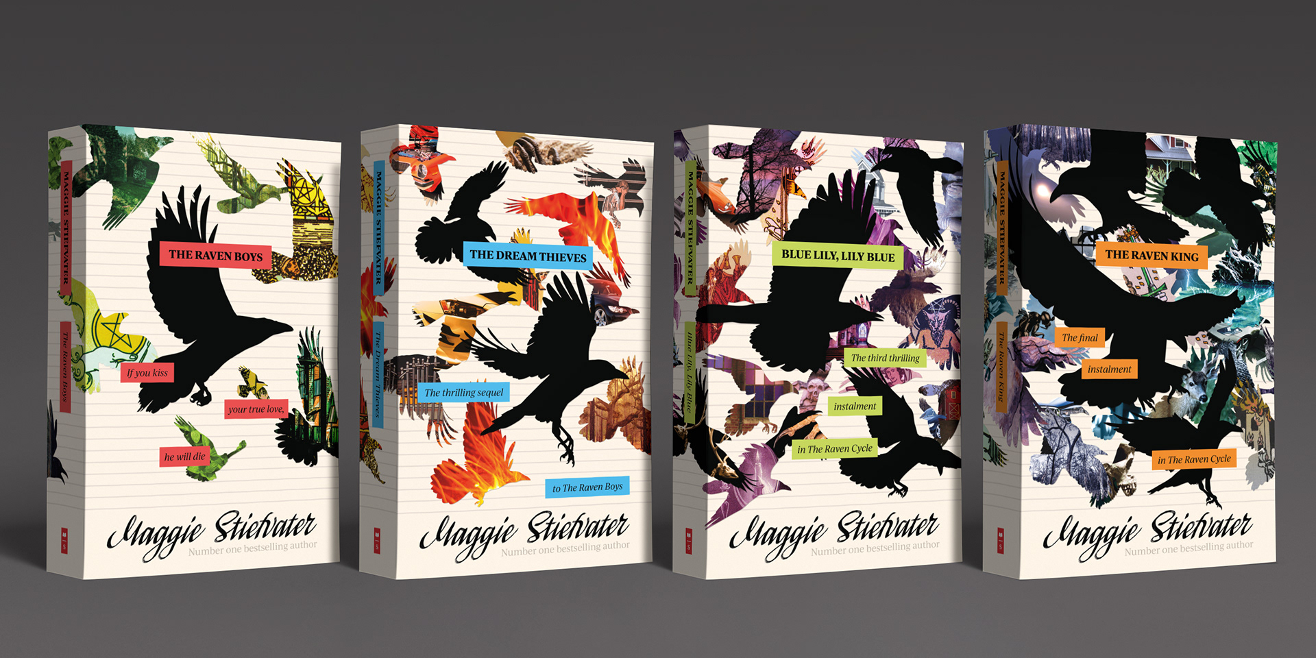
“They were everywhere: The air dazzled and shimmered with feathers and down. The birds swirled and dived and plummeted around the neighbourhood street, the streetlights catching wings, beaks, claws. Most of them were ravens, but there were others, too. Little chickadees, streamlined mourning doves, compact jays. These smaller birds seemed more chaotic than the ravens, though, as if they had gotten caught up in the spirit of the night without understanding the purpose. Some of them let out little squawks or cries, but mostly the sound was wings. The humming, rushing whoosh of frantic flight.”
– Maggie Stiefvater, The Raven King
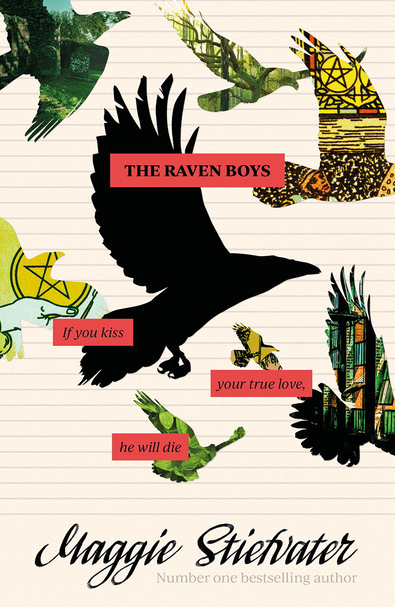
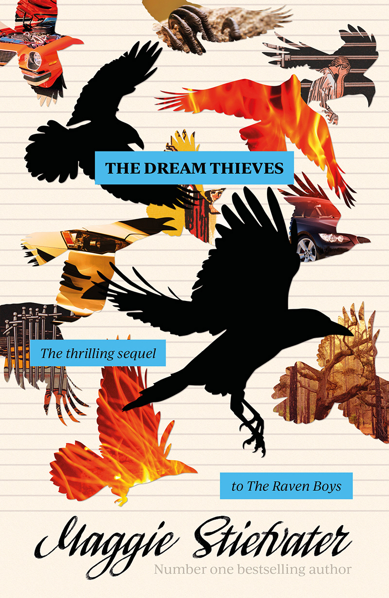
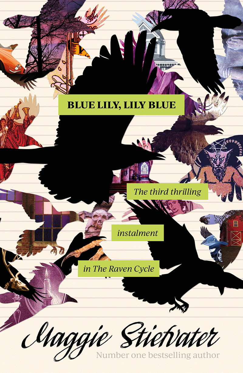
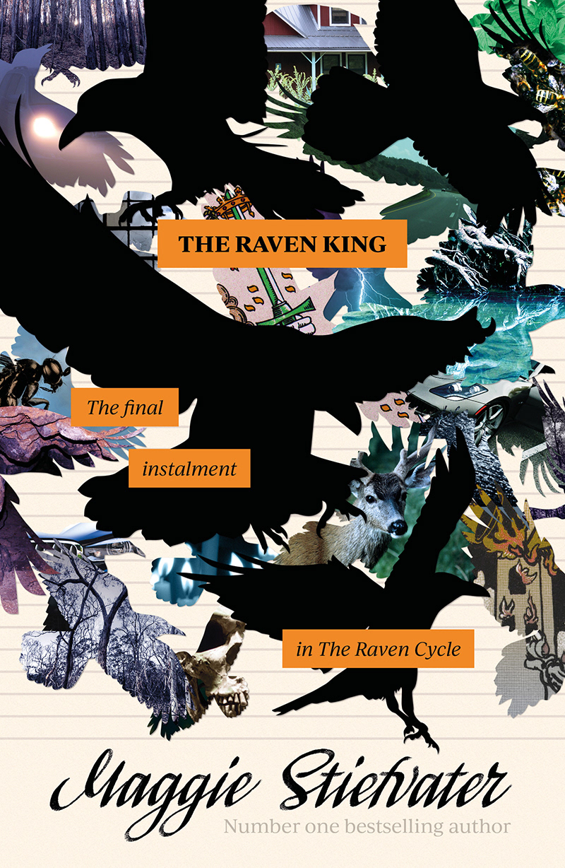
The Raven Cycle by Maggie Stiefvater is a series I read many times. It is a complex story told in multiple point of view. Its characters, rooted in realistic psychology, populate a modern day Virginia where magic is lurking beneath the surface.
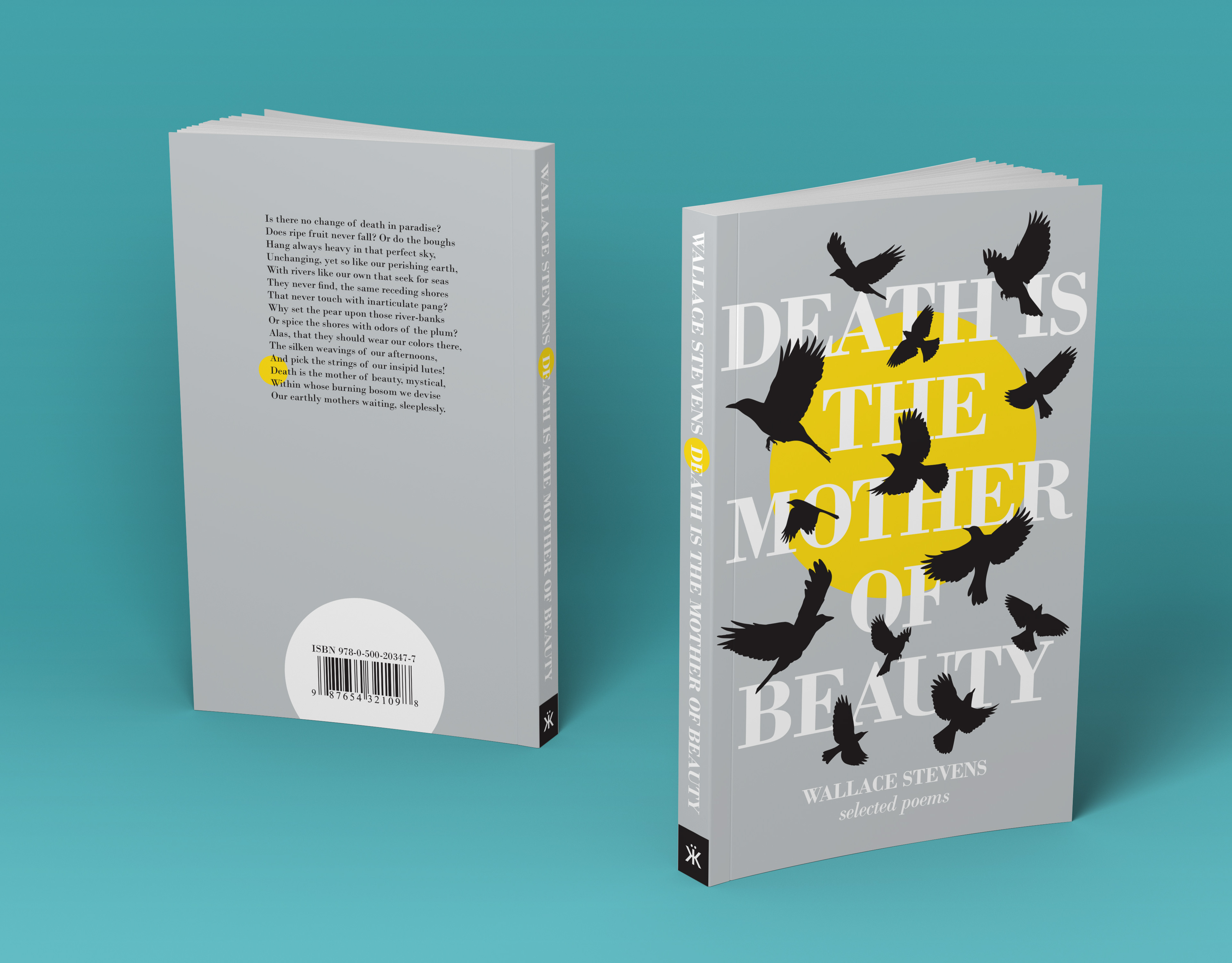
I'd toyed with the idea of what covers I would have designed for these books for quite some time, and when the author was coming out with a whole new trilogy set in the same world, it felt like the perfect time to bring design into reality. It was inspired by a pivotal scene in the fourth book that the quote above is from. The image of a flock of birds swirling around each other was as a lovely visual metaphor for the story.
I gathered several images relating to the plot of each book and place them into bird silhouettes.
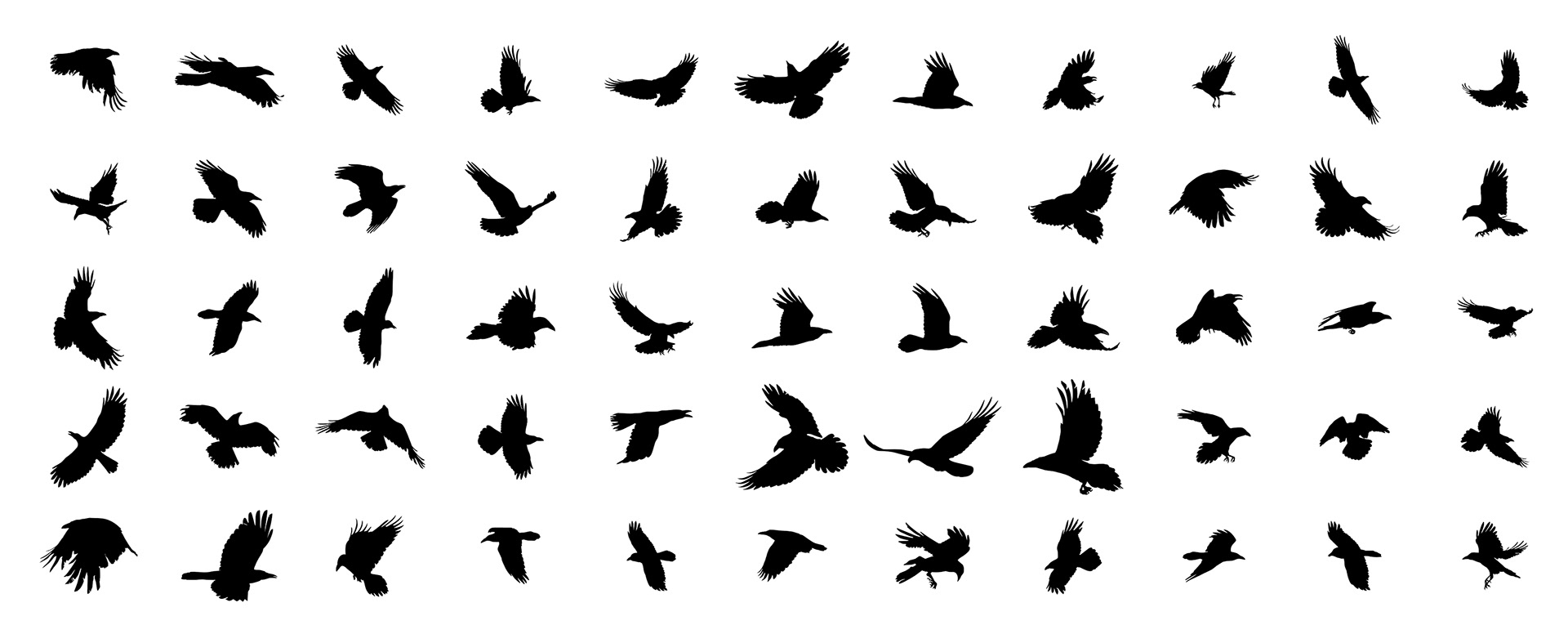
First I created some vector silhouettes, referencing stock images of ravens. Than, I spent a couple of hours shifting these around till I came to a composition I liked.
There is an escalating nature to the narrative. As the group unearths more and more magic in their quest, we get from a slightly paranormal story set in a mostly realistic world, to a chaotic dreamscape where reality seems to have little meaning. The growing number of birds is meant to represent this escalation.
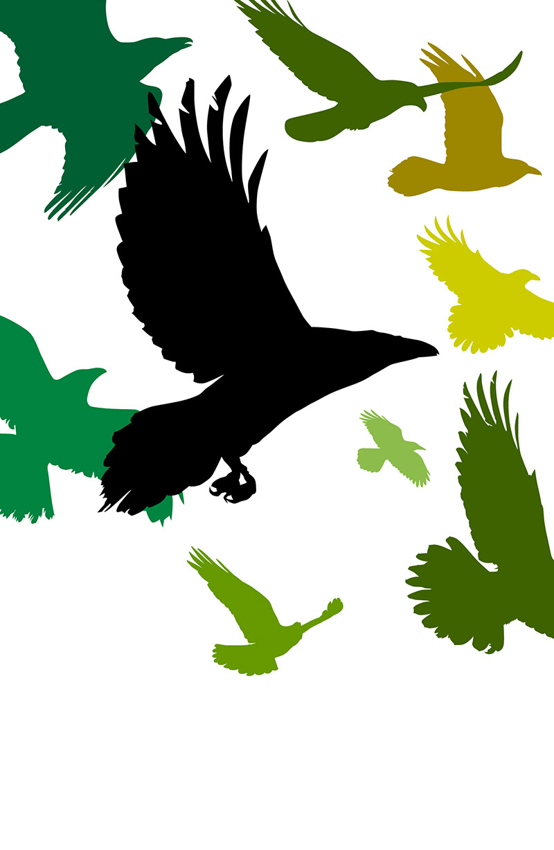
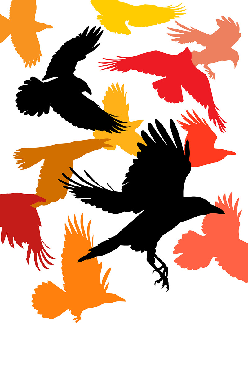
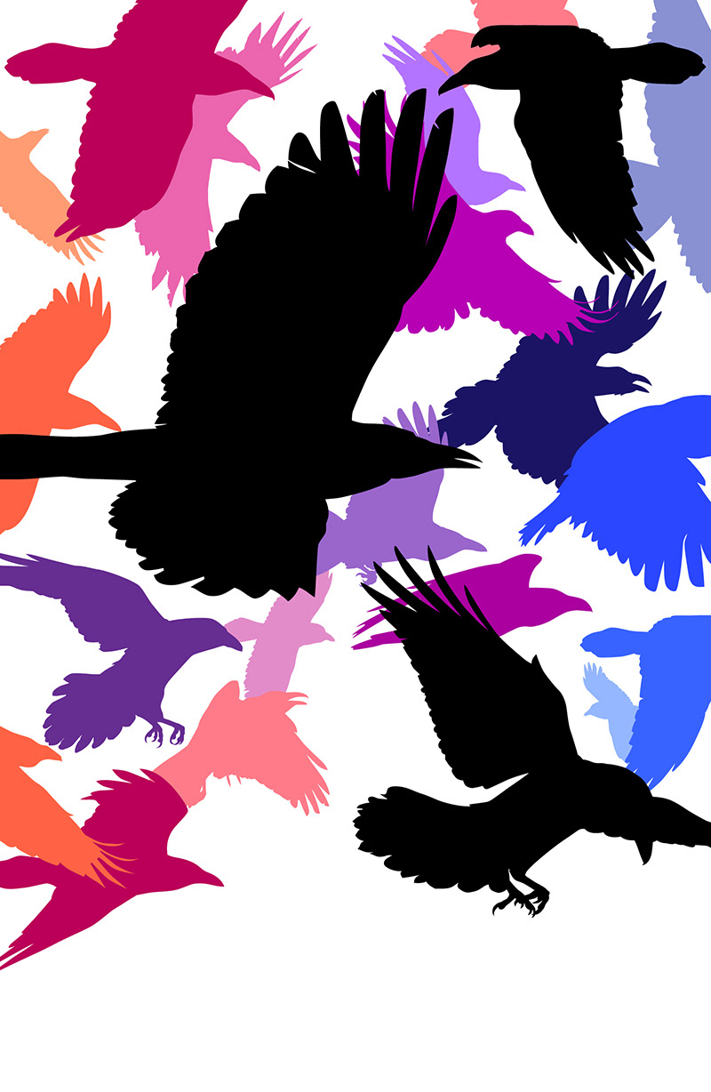
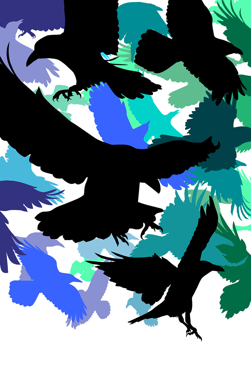
I created a spectrum of colours across the covers. Green, orange, purple, and blue fit the mood of the individual books nicely. This later got reduced to looser colour theme, in order to allow for certain iconic objects – such as a bright orange Camaro – to keep their signature colours.
I included plain black silhouettes, the number of which reflects the order of the books, to make sure the shapes were recognizable as birds even on the last volume.
Since the covers were pretty busy already, I chose to keep the typography relatively simple,
and support the collage look, that had a connection to the journal of a main character.
Ivy Journal was the perfect font for this purpose.The authors name is custom lettering I drew myself.
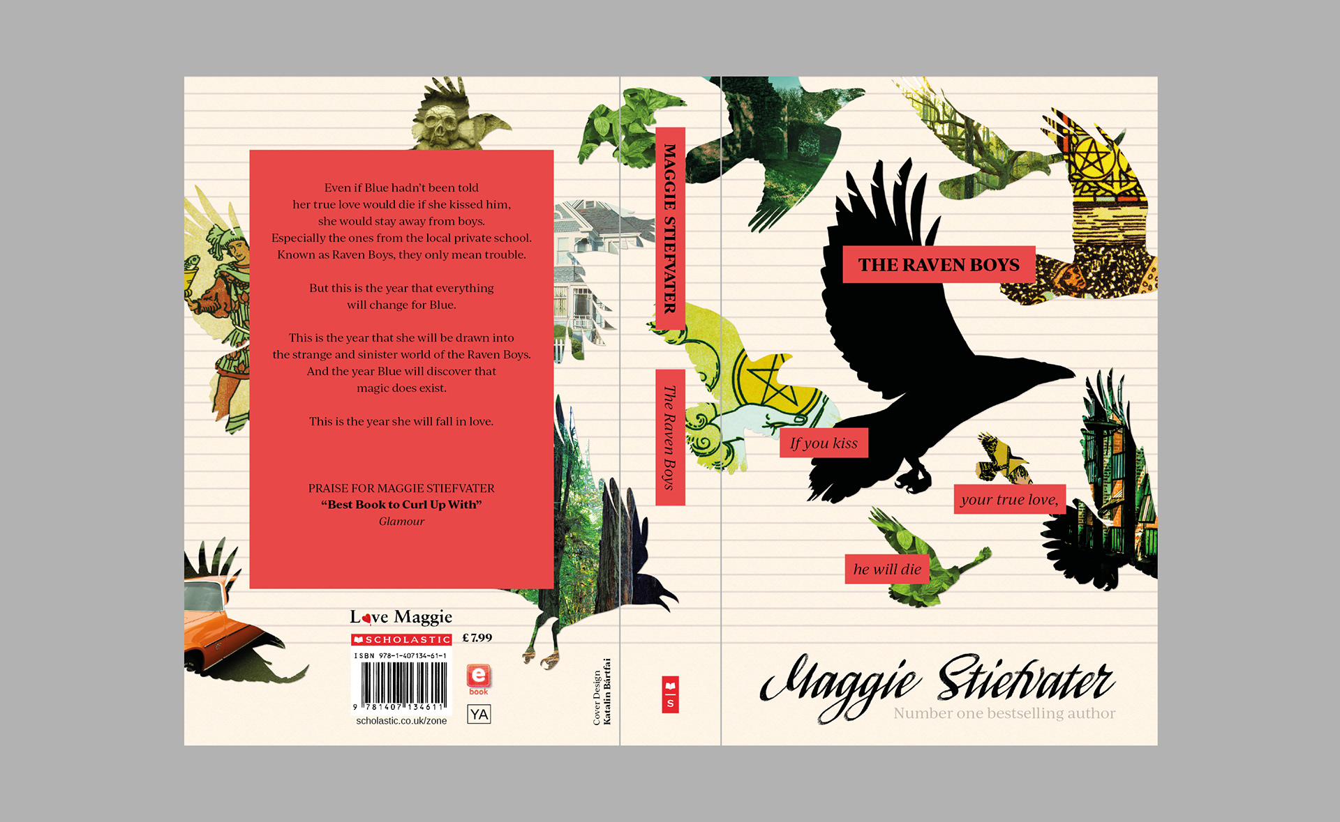
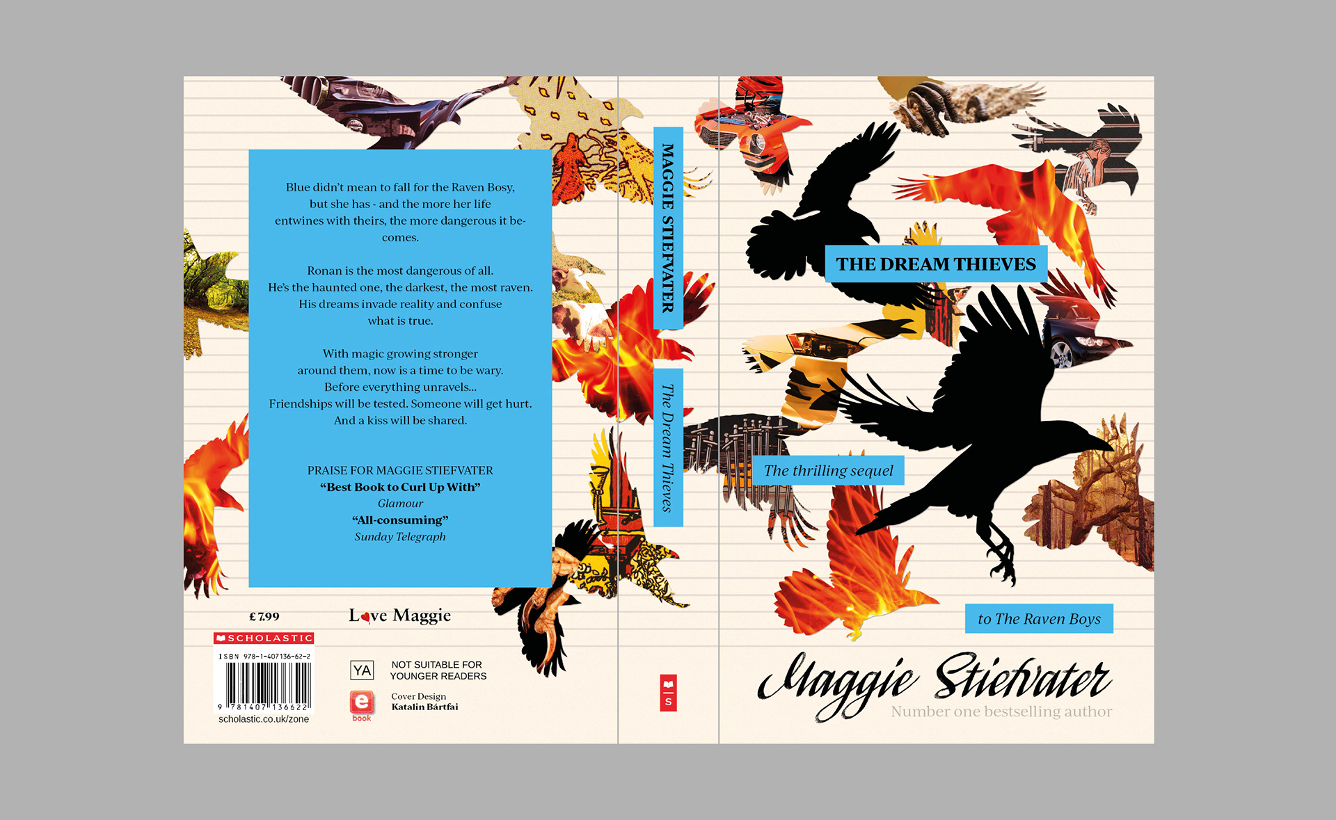
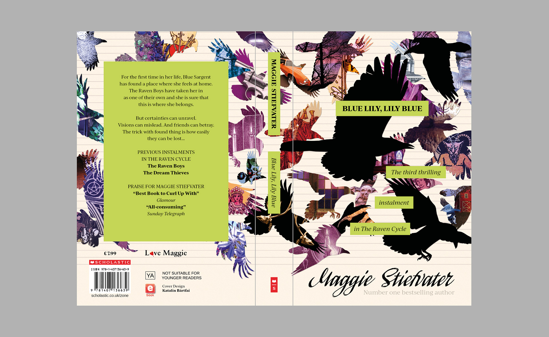
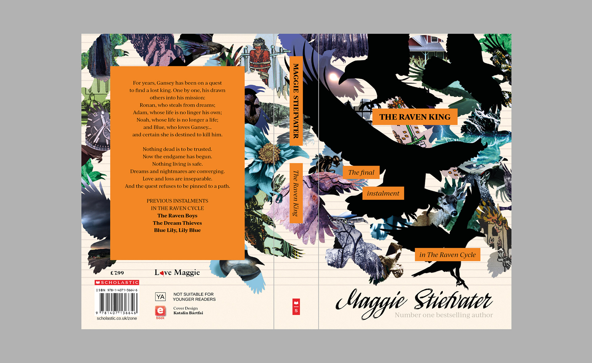
Note: The logos and texts on these covers are not mine. I took them from the originals. This is a self-initiated project I created for my own creative satisfaction. I'm not affiliated with the author or publisher in any way. I'm just a fan of their work, who was inspired by what she read.