“Magic. It's a cheap word now. Put a quarter in the sloth and get a magic trick for you and your friends. Most people don't remember what it is. It is not cutting a person in half and pulling a rabbit out. It is not sliding a card from your sleeve. It's not are you watching closely?
If you've ever looked into a fire and been unable to look away, it's that. If you've ever looked at the mountains and found you're not breathing, it's that. If you've ever looked at the moon and felt tears in your eyes, it's that.
It's the stuff between stars, the space between roots, the thing that makes electricity get up in the morning.
It fucking hates us.”
–Maggie Stiefvater, Call Down The Hawk
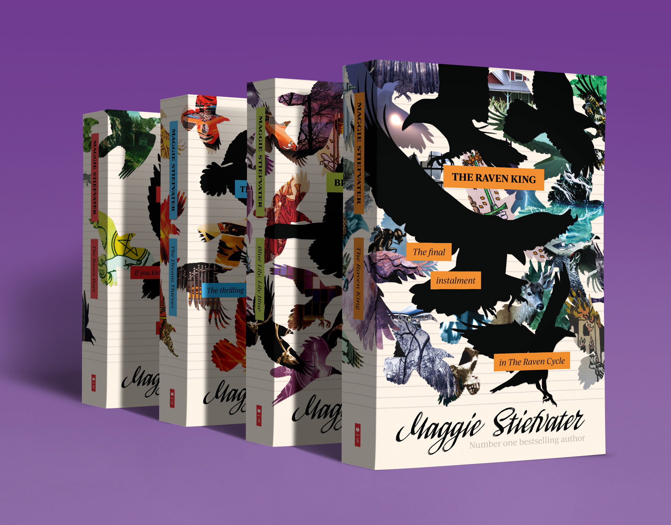
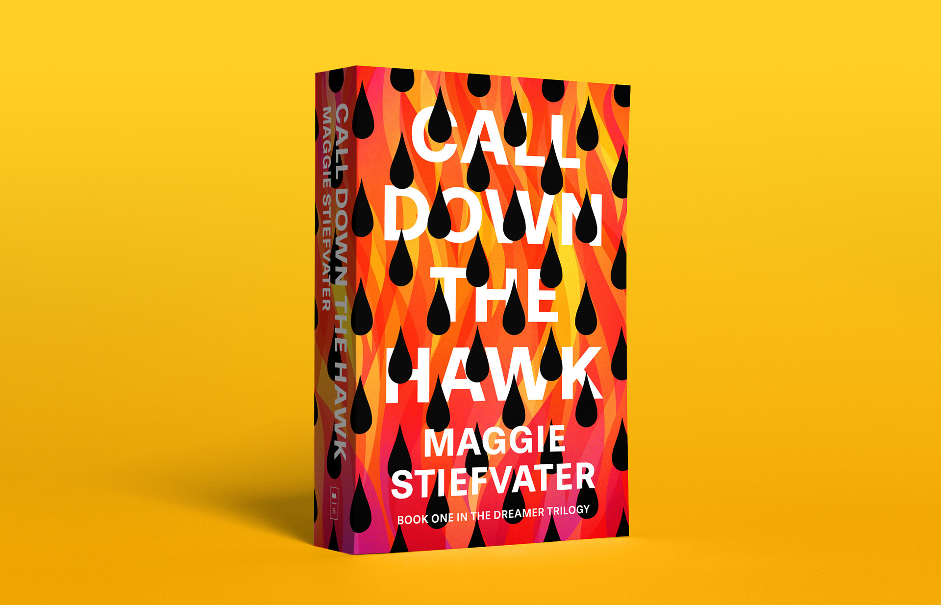
Call Down the Hawk is the first book of a trilogy set in the same world as Stiefvater's The Raven Cycle series.
I was excited, but also nervous to read it. Sequels of this kind don't always live up to our expectations, but The Dreamers trilogy is clearly an entirely new story that just happens to involve some characters, readers of the earlier books are already familiar with. You don't need to have read The Raven Cycle in order to enjoy it. It has different themes, and a different atmosphere. The things that made me fall in love with her previous series are still here though: a deep understanding and intriguing exploration of human psychology, complex characters, multiple point of view, and an artful and unique writing style that is entirely Maggie and no one else.
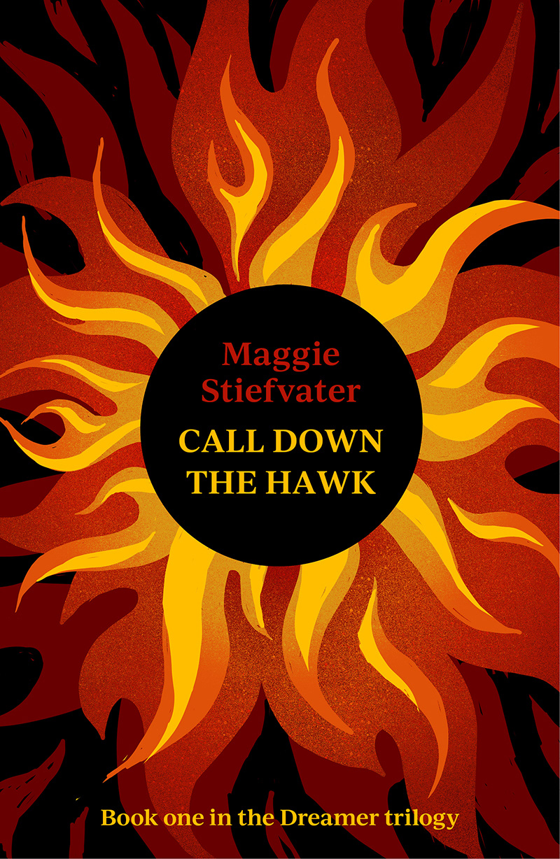
While I was reading I made thumbnail sketches about cover ideas, and once I was done I picked three of these that I found promising and created some more fleshed out comps.
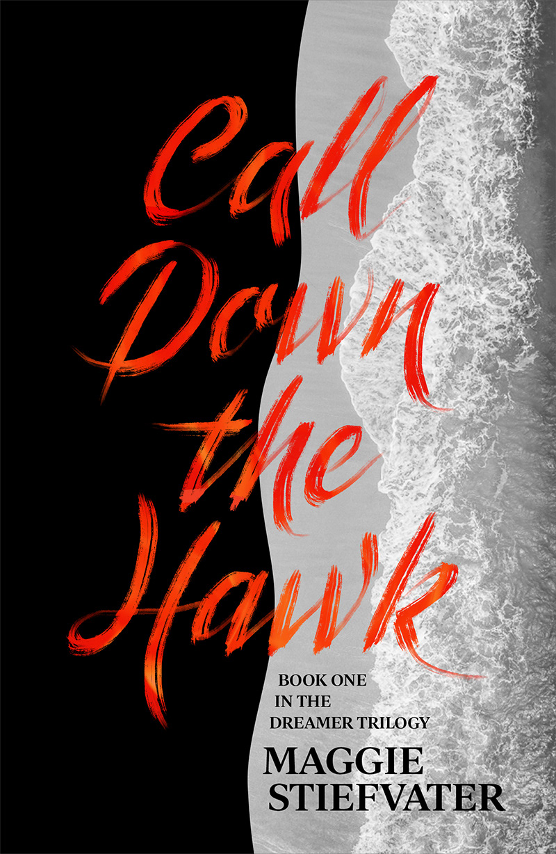
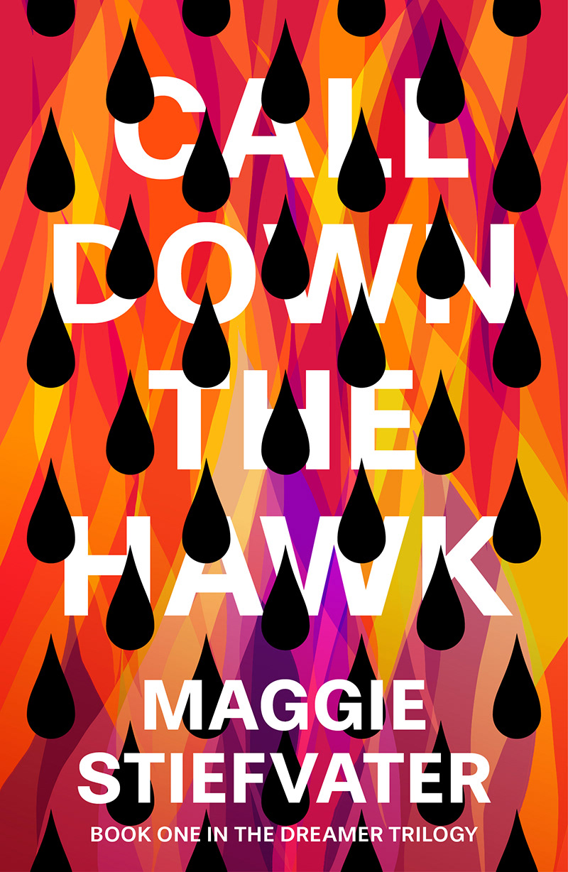
Fire is a returning motif throughout the book, and it is effective as a visual for capturing the mood as well, so most of my sketches had to do with it in some way. I also toyed with using the ocean shore – some memorable scenes are set there. In the end I went with the combination of fire and black drops instead.
I drew the first version of the flames on my iPad, than brought it into Illustrator to create a vector imageand extend the design to the full cover.
I chose a simple sans serif font – Stevie Sans – in order to make sure that the type was still legible even with the drops overlaying it.
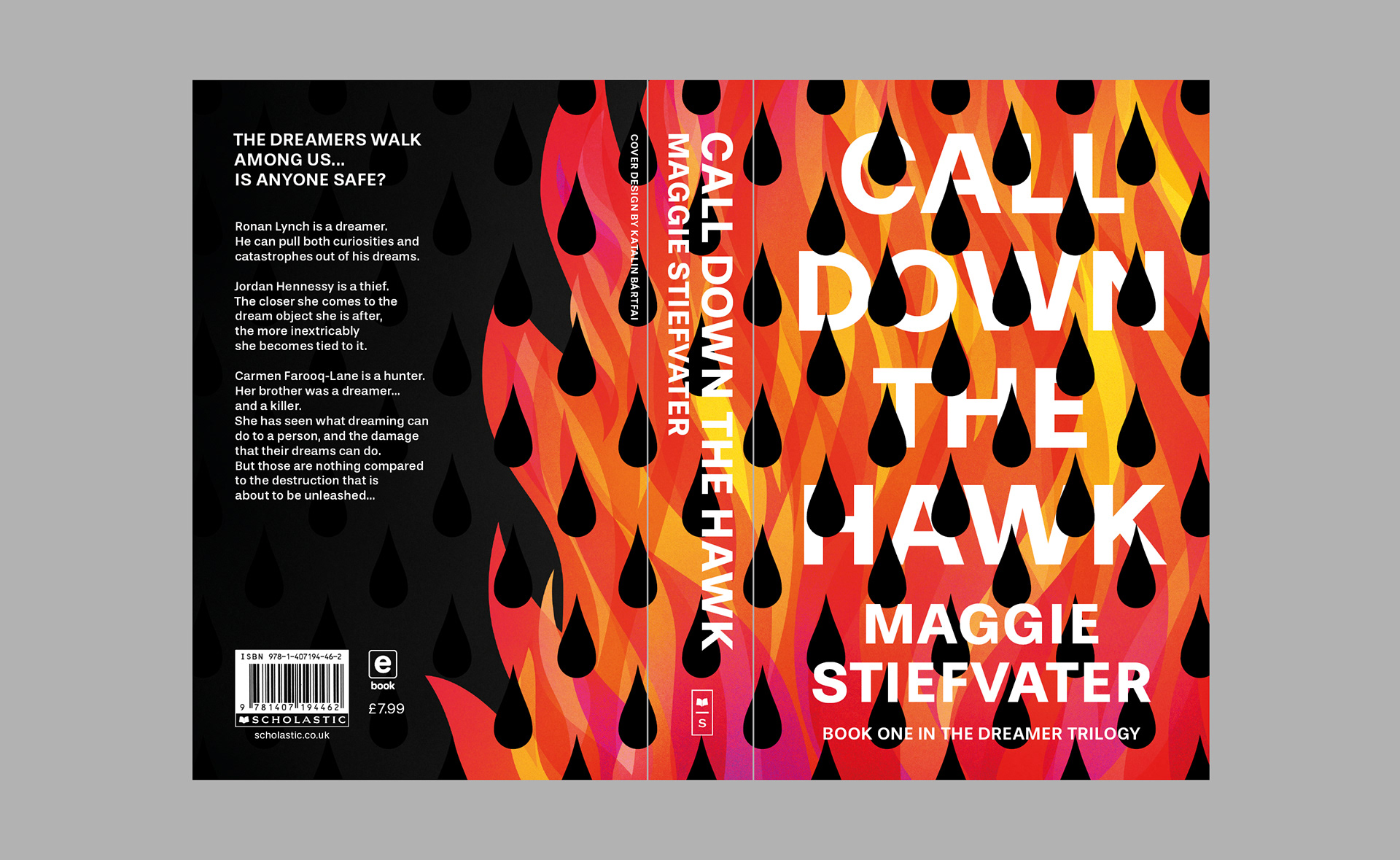
Note: The logos and texts on this cover are not mine: I took them from the original. This is a self-initiated project I created for my own creative satisfaction. I'm not affiliated with the author or publisher in any way. I'm just a fan of their work, who was inspired by what she had read.