
Magda Szabó is one of the best know Hungarian authors of the twentieth century. Her works often focus on intriguing female characters and their relationships with each other. Az őz (The Fawn) is no exception. It is the life story of an actress told in a series of flashbacks, focusing on her obsessive hatred of another woman, and the efforts she made to take everything away from her. It is an intricate psychological portrayal of childhood trauma and what it does to a person. The book is like it's main character: melancholic, eloquent, and violent.
I've read a lot of books in English in the last few years, and this was the first Hungarian book I picked up in a long time. It reminded me of how beautiful my mother tongue can be and inspired me to read more Hungarian books in the future.
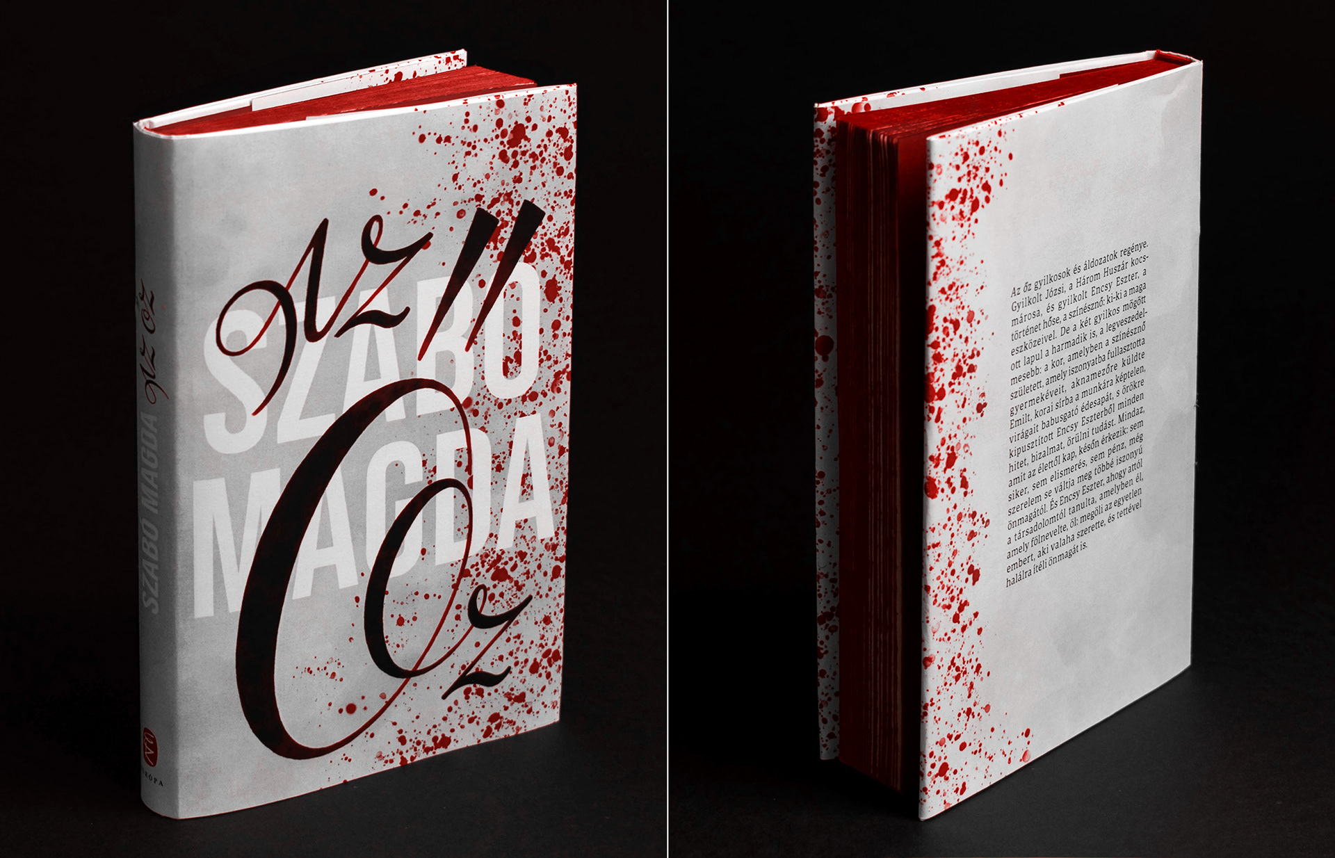
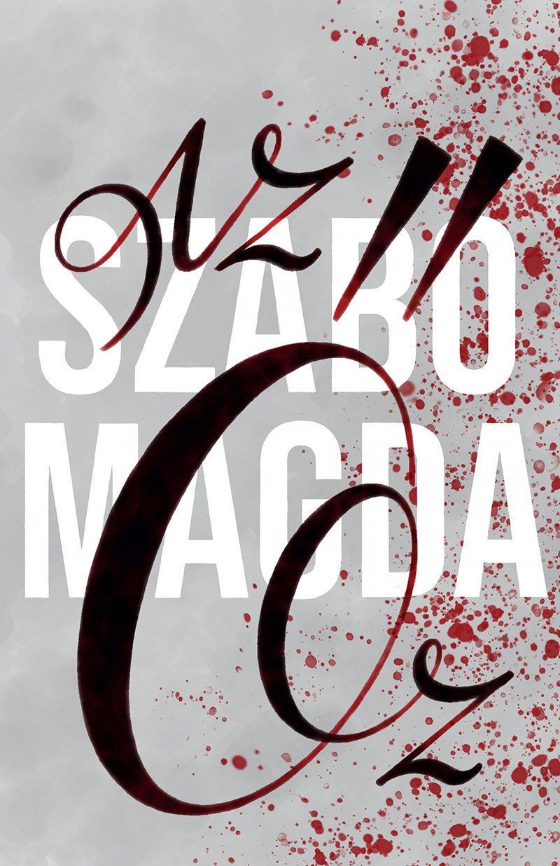
Oddly, the first decision I made was colour. I generally leave this step last, but this time the idea of having a light grey cover contrasted with red edges occurred to me even before I got to the end of the book and I just knew it was the right choice.

Az őz is written from Eszter's point of view. She is addressing another character of the story in the second person, and talking about her target most of the time – focusing on a third person.
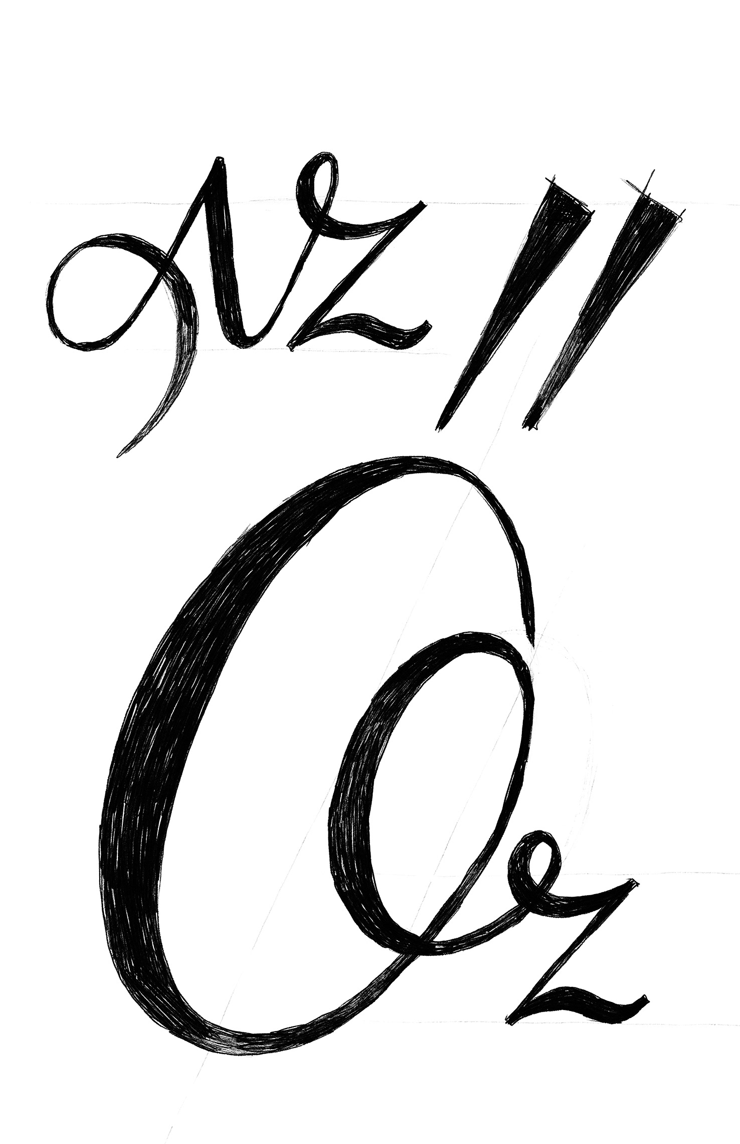
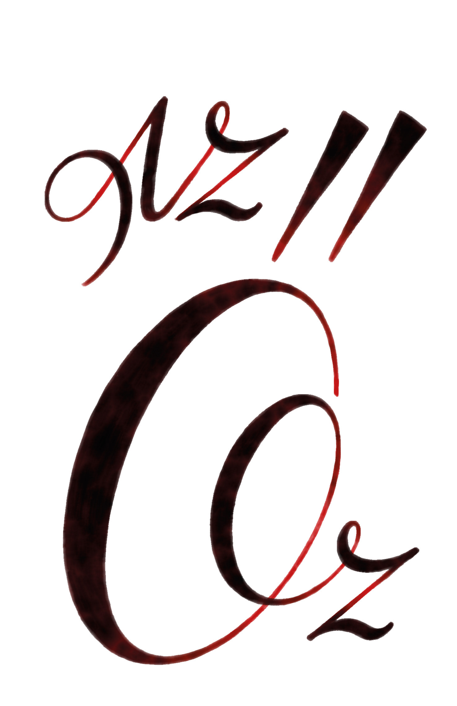
In Hungarian, our third person singular pronoun is “ő”. My idea was to bring out this one letter word from the title. I've spent some time sketching different letterforms, and came to a solution I liked, where the large “ő” spiralled into its connection with the “z”, than took this sketch into Illustrator to make some adjustment.
Later in the process, I decided to soften the lettering a little, and drew a digital watercolour version in Fresco (a new app I really enjoy playing with right now) using the vector version as a base.
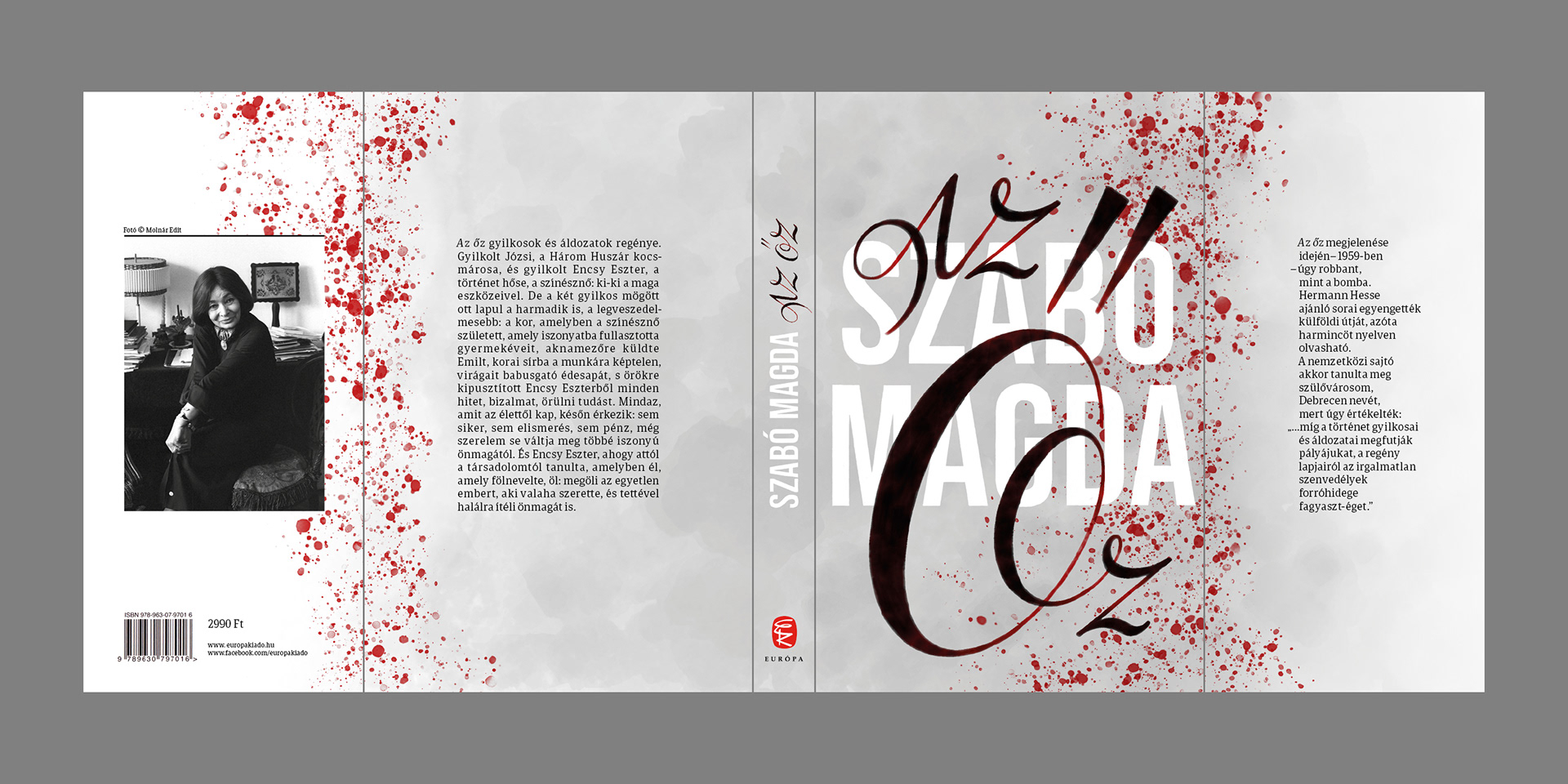
Since we are talking about a very famous author, I wanted her name to appear in a large font. Laying the title over the author's name felt like a nice little nod to the layered personality and many false identities of the main character.
The red splatter at the edges was a simple and effective way to evoke the violent events that take place in the book.
The tall shapes of Bebas Neue worked great for the author's name, but it is not meant for longer texts:
I set the rest of the copy in Portada.
I set the rest of the copy in Portada.
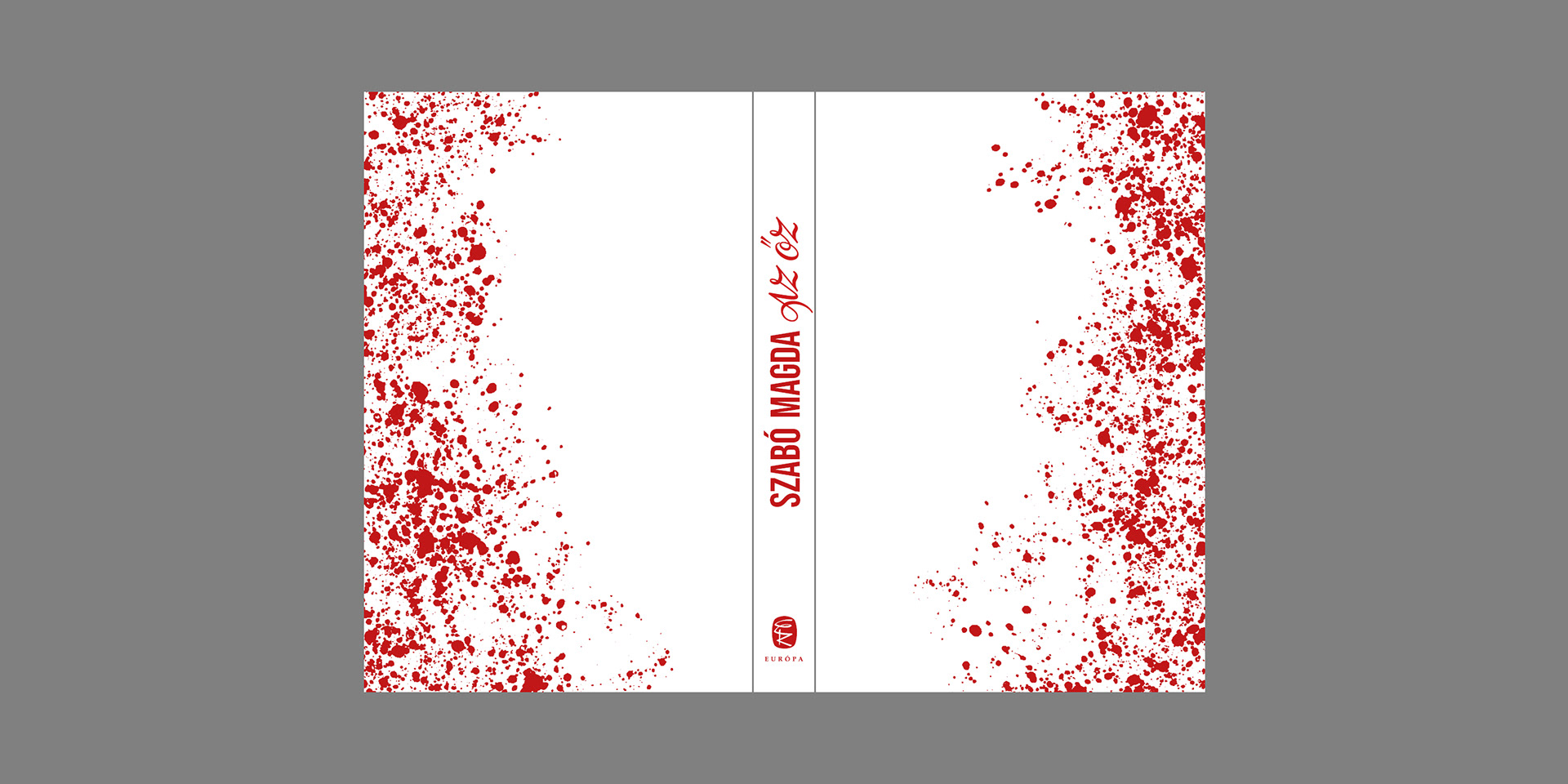
The binding design is a simplified version of the jacket printed in one colour.
The logo and texts on these designs are not mine: I took them from the Európa edition of Az Őz. This is a self-initiated project I created for my own creative satisfaction. I'm not affiliated with the publisher or any other right holders in any way. I'm just a designer, who was inspired by what she had read.